
Change is necessary
Something needs to change
Ever since the market crash of Y2K, the tech bubble that burst in the early 2000’s, I’ve seen a reactionary response to crisis that seemed to further erode genuine prosperity. The tech bust was on the heels of excessive tech spending and stratospheric stock valuations. The response in Washington and the Fed was to lower interest rates and encourage people to go shopping. This led to a massive bankruptcy of the American people and the financial crisis of 2008. To get the economy going again the government racked up unbelievable deficits while the Fed dropped interest rates and consumed unwanted assets, building its balance sheet to levels unthinkable in the past.
In early 2009 I realized I needed to better understand the fundamentals driving our economy and began studying the Federal Reserve quarterly Flow of Funds. What remained crystal clear over the years of analysis was that while the economy appears strong and generally healthy, we have fundamentals in our country that are deteriorating and need to change.
The charts that follow are a sample of the data I collect, analyze, and use to help me determine the general health of our economy.
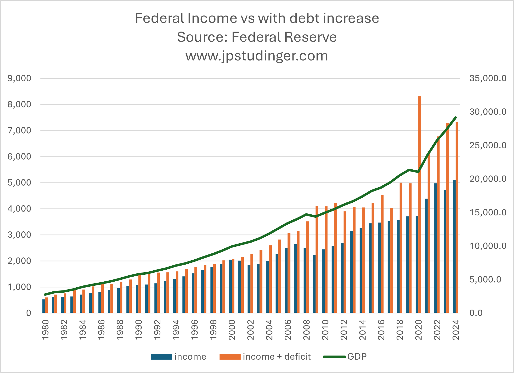
Our federal debt, deficits, and income explained.

This chart shows that federal income grows along the same line as GDP (our economy). As it should. However federal spending grows at a much faster rate than revenues. That disconnect is not healthy. In a business or household scenario, that same relationship between spending and income would lead to bankruptcy.
It illustrates a problem that has been developing for decades, and that I’ve been concerned about since 2009. The problem has been disguised for many years with ultra-low interest rates. We, or more precisely our representatives in Washington D.C., have been lured into horrible fiscal decisions with delayed negative consequences.
Do you think the spending growth rate exceeding income chart above shows a problem?
This chart shows the gap between federal income and spending. If you look closely, you will see there was only a moment in 2000 where they aligned. The massive 2020 spike in deficit was in response to an economic shutdown during covid. That was followed by up to $2 trillion annual deficits. To put that number into perspective, Germany’s entire budget, the 3rd largest economy in the world, is slightly larger than just our current $2 trillion deficit.
In its most simplistic understanding, our federal debt is a collection of our deficits over time. Unlike a mortgage on your house, where you make a principal and interest payment - the federal government only makes interest payments. It does not pay down the principal. The payment is a simple calculation of the amount borrowed multiplied by the charged interest rate. For example, if they borrow $2 trillion at 1%, the payment is $20 billion. If the interest rate is 4%, the payment is $80 billion. That payment will not go away. Why? Because we never pay down our debt. The only physical way of paying down debt is to have a surplus, not a deficit. Each time the government runs a deficit they increase the amount of total debt.
Do you think the deficit chart above indicates a problem?
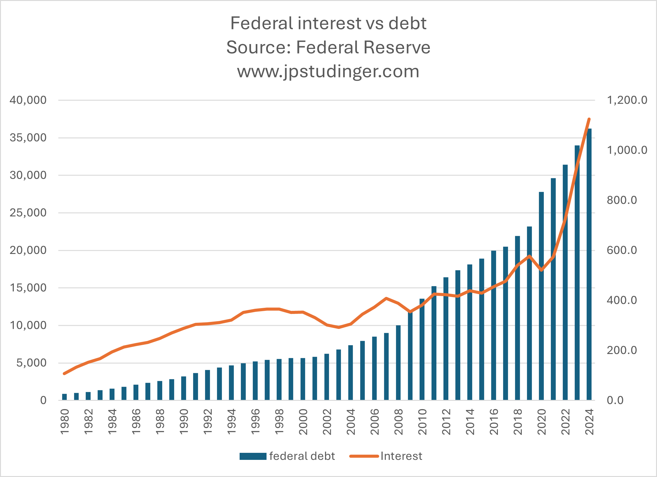
This chart illustrates how those in Washington D.C. were able to get so reckless with the budget. The total debt owed in 1995 was right around $5 trillion. The total amount owed in 2017 was just over $20 trillion. That’s an increase of 300% to debt. However, the payment only went from $352 billion to $477 billion, an increase of just 35%. In fact, even though our debt was massively increasing, the amount of interest owed as a percentage of our budget was declining. It’s just back to that basic math described earlier. While they were racking up debt and deficits, interest rates were falling. And even though we owed much more money than before, it was charged at lower interest rates, and therefore, it wasn’t a problem to be realized until later.
Even though we borrowed a tremendous amount of debt during covid, as illustrated by the previous chart, you can see in this chart that our interest payment dropped in 2020. That’s because during covid the fed lowered interest rates to near zero. However, math is math. Eventually interest rates were sure to rise, and so in turn the payment would also rise. As you can see, it has more than doubled since 2017 and is now around $1.2 trillion.
Do you think the massive sudden and permanent increase to interest payments are troubling?

This chart shows the relationship between our federal interest payment and the direction of interest rates.
We’ve added 8.5 trillion of debt since interest rates went from 2% to 3.12%. An increase of 22% to total debt with a 56% increase to the interest rate charged. As a result, the payment increased 83%, going from $612 billion to about $1.2 trillion.
This increase in debt payments was always going to happen, but it became especially acute with the massive deficits in the past four years since covid. As you can see from the chart, our average interest rate on the debt is still far below the historical averages. If/when we experience another uptick to interest rates our debt payment will increase substantially more. If interest rates were at 5% our payment would be almost $2 trillion. Keep in mind that our entire federal income is just over $5 trillion.
The money that is spent is gone forever. But the interest obligation remains – forever. Even if we could keep the interest payment at $1.2 trillion, which is mathematically impossible as we rack up more deficits, we would pay over $12 trillion in interest alone in the coming decade.
Do you think the historical interest rate vs. interest payment chart illustrates a problem?
Who’s been left behind
The previous charts show the outcomes of what I believe to be the result of reckless fiscal decisions in Washington. But it’s more than just improper spending that got us to this point. There is a bigger issue that has been developing for decades. The following charts help to illustrate.

This chart shows the disturbing trend of income inequality in our country. AGI stands for adjusted gross income. The data is collected by the IRS and categorizes how income is distributed throughout our taxpaying citizens. Only two lines above have been increasing since 1980: the top 1% and between 1% and 5% of income earners in our country. Basically, the top 5% of income earners have been massively increasing their share of income in this country while the bottom 85% of earners have been losing their share of national income.
Do you think the chart above shows an unhealthy trend of income distribution?

One statement often used by politicians, which I hate, is “just pay their fair share.” It’s a divisive statement and deflects the real problem and solution. 40% of taxpayers don’t pay taxes at all. In fact, they get a tax credit, meaning they are paid to be a citizen. The bottom 50% of taxpayers pay around 3% of all taxes. The next 25% of taxpayers pay about 10%. So, 75% of our country only pays 13% of all taxes. The top 5% of our country pays 61% of all taxes. The top 1% makes up about 22% of national AGI and pays 40% of all taxes. What that means is about 1.5 million people pay 40% of the tab for about 340 million people in the US. That sounds like a “fair share” to me.
But even more importantly, it deflects the real problem. The real problem is that people in our country don’t make enough money, which creates a system where just a few are subsidizing everyone else. We don’t want a society that is placated with subsidies. We want a society that is rising with real economic growth and property.
When too much dependence is placed in less than half of one percent of our citizens (0.4%), we have a system that is too dependent on the success of a few and not diversified throughout an entire population. In any normal business scenario, that is a scary and unhealthy dependence on just your top customers.

Do you think the chart above illustrates an unhealthy dependence of government’s income to just a tiny fraction of its taxpayer base?
Regarding current tax rates - here is an opportunity for you.
I showed some charts that identify problems, and here is a chart that illustrates an opportunity. There is a way to repair some of our fiscal problems and increase prosperity for the rest of our citizens.

The chart above shows the declining rates we have all been paying to taxes as a percentage of income. I’ve been repeating this simple statement for close to a decade now, that “we have the worst fiscal balance sheet in the history of our nation and some of the lowest tax rates in the past 100 years”. I believe that part of the solution to dig us out of our hole will be that we all pay more taxes in the future. I think it’s inevitable and, once again, simple math.
While that might sound alarming, there is an opportunity here. Back in 1980 we didn’t have Roth IRAs and 401(k)s available mainstream. Instead, people saved pretax money into retirement plans. While that little tax break up front was appealing, it leads to larger taxable distributions in retirement. I think that everyone across the country should stop saving pre-tax into their retirement plan and instead save as a Roth in their 401(k)s. Just about every employer now has a Roth option available within their plan, but very few people are taking advantage of it. If the pendulum swung away from pre-tax savings, two very positive things would happen. 1) The federal government would collect more tax revenues as there would be more revenue to collect from. And 2) Retirees would have a lower tax bill when they need the break most, in retirement.
So far I’ve illustrated the federal balance sheet problem that has been developing for decades, and has finally come to a head because of simple math, interest rates went up and we owe more. I’ve shown the math on income distribution in our country, and the reality of who’s paying all the taxes, and how dependent our nation has become on the income of a few to pay our bills. I’ve shared that we have became a nation that focussed on subsidizing the cost of living for people, instead of a nation that has strong wages for the masses.
Events that correspond with the majority of American’s losing ground in national AGI.
These following charts will help to illustrate how we developed into a nation with such income inequality.

There has been lots of talk about the trade deficits we have with other nations. The chart above illustrates this trend since 1960. I separated trade into goods and services and included a “total” line. We have become a nation of financial and tech services to other nations, but we rely on other countries to produce our goods. Our goods deficit has exceeded $1.2 trillion. You’ll notice that the trends align along the same timetable as the swing of income disparity in our country.
Do you think that it’s a problem that we rely so heavily on other nations to make the products we buy and use daily?

The chart above shows the declining share manufacturing makes as a percentage of our GDP (economy), at just 10% today compared to nearly 30% in the 50s. I live near Detroit, and I’ve heard it said many times that we need to manufacture out of the U.S. for products to be affordable. I’m in finance, not manufacturing. So, my knowledge here is limited. But I do pose one obvious question. How is Tesla so successful? This company manufactures the majority of its cars in the U.S., is the most American of all the car companies, sold more of its Model Y than any other passenger car in the U.S. in 2024, and makes the top 10 list of most valuable companies in the world, even after its recent drop from being valued at over $1 trillion dollars earlier this year? Tesla dwarfs GM’s market value of $43 billion and Ford’s at $38 billion.
I have a patent on a gambrel, which is a tool used for the processing of game animals, namely deer. It’s the best design on the market, and really the only material changes to the gambrel since the invention of the gambrel itself. I have not produced it yet, because I can’t find a company in the U.S. able to produce it for me at a reasonable price. Gambrels sell at Cabela’s for around $25. The quotes I’ve had for production are closer to $100. And as good as my gambrel is, I don’t think people will pay over $200 for one.
Here's what I don’t understand. How is it that we don’t have even one massive manufacturing plant in America that produces product for thousands of small businesses in our country? Instead, thousands of small businesses ship their designs to places like China, where they are produced and shipped here to be sold at stores. Small businesses employ over half of the US. How many of those companies ship their design overseas, because they can’t afford to produce their product in the states? And how many businesses, like my gambrel, don’t get produced at all because they don’t want them produced overseas?
America does know how to produce things. Tesla is a shining example of that. And there are plenty of others. My favorite trail camera is made by Reconyx. They are the most reliable trail cameras by far. I leave them in the woods 12 months at a time, and they flawlessly take images and videos of animals enduring the weather elements of Michigan’s Upper Peninsula. I’ve used them for over 15 years, and they still work perfectly. They are the only trail camera that’s made in the USA, and they are the best.

Our trade deficit began a massive spiral in goods from the early 1990s through today. During that time, we’ve amassed another $33 trillion of debt. I reflect on all the countries, military, people, programs, green energy… things we’ve subsidized along the way, and ask how is it we couldn’t develop a program to subsidize a state of the art, green, safe, humane, and productive mass scale manufacturing plant to support all the small businesses in our country with a portion of that $33 trillion? How have we gotten to the point where someone like me can’t find a company capable of producing a simple gambrel at a reasonable price? That doesn’t make sense to me.
Do you think that we should produce more things in the USA?
This is where it’s headed.
Throughout this article, after each chart, I asked you a simple question. Do you think that the chart illustrates a problem? If you answer yes, then you believe that something isn’t right, and therefore change is necessary.
Change is seldom met with excitement. One of my good friends told me, “The two things we fight the most are change and loss. But two things that are inevitable in life are change and loss.” Too many people in our country have been losing for a long time. I believe change is necessary to help them start winning again.
Time will tell whether tariffs are the correct solution. Whether they are more of a negotiating tool than a permanent fixture. What the rest of the strategy is. And what creativity and ingenuity Americans have brewing as they work toward a brighter future. I believe in people, specifically the power of millions of people striving for solutions to improve their place in life and the future of their families. Americans are smart, creative, and know how to hustle.
As dire as our fiscal issues are, there is a way forward. And, just as with the other charts, it’s simple math. The federal government collects a certain percentage of GDP. They increase or decrease that amount depending on tax rates. They also spend at a certain rate, which has been increasing, but they do have the power to make cuts, and cap spending for future budgets. And 340 million people in our country have the power to think, create, and work to grow our economy. The trajectory of our federal finances can be projected with assumptions for economic growth, tax rates, and spending caps.

This chart shows a fair representation of our current situation. GDP growth is right around 2.5%. and a fair assumption is that federal spending increases by around 6% per year. The blue bar in the graph above is our projected deficit, not our total debt. If we keep doing what we are doing, our federal deficit could be around $48 trillion in 2060, from $2 trillion in 2024. It’s safe to say that something would have broken by then.
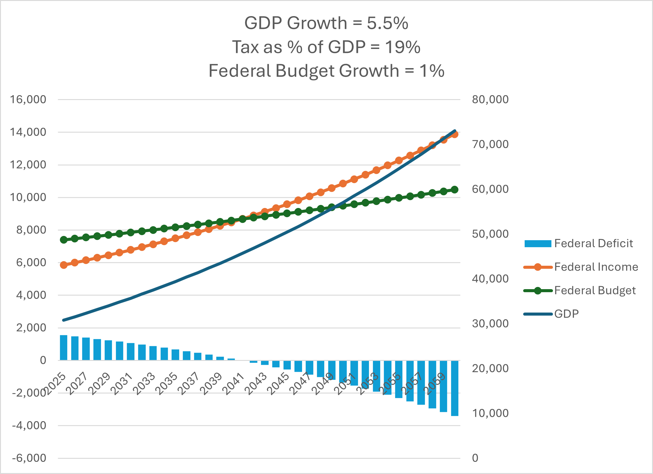
The chart above shows changes made on all fronts – increased GDP growth, higher taxes, and cuts to spending over a sustained period. It shows a balanced budget in about 15 years followed by surpluses. The assumptions are much more aggressive than current reality. But it’s important to show that there is a way forward that doesn’t take our country to a point of no return.
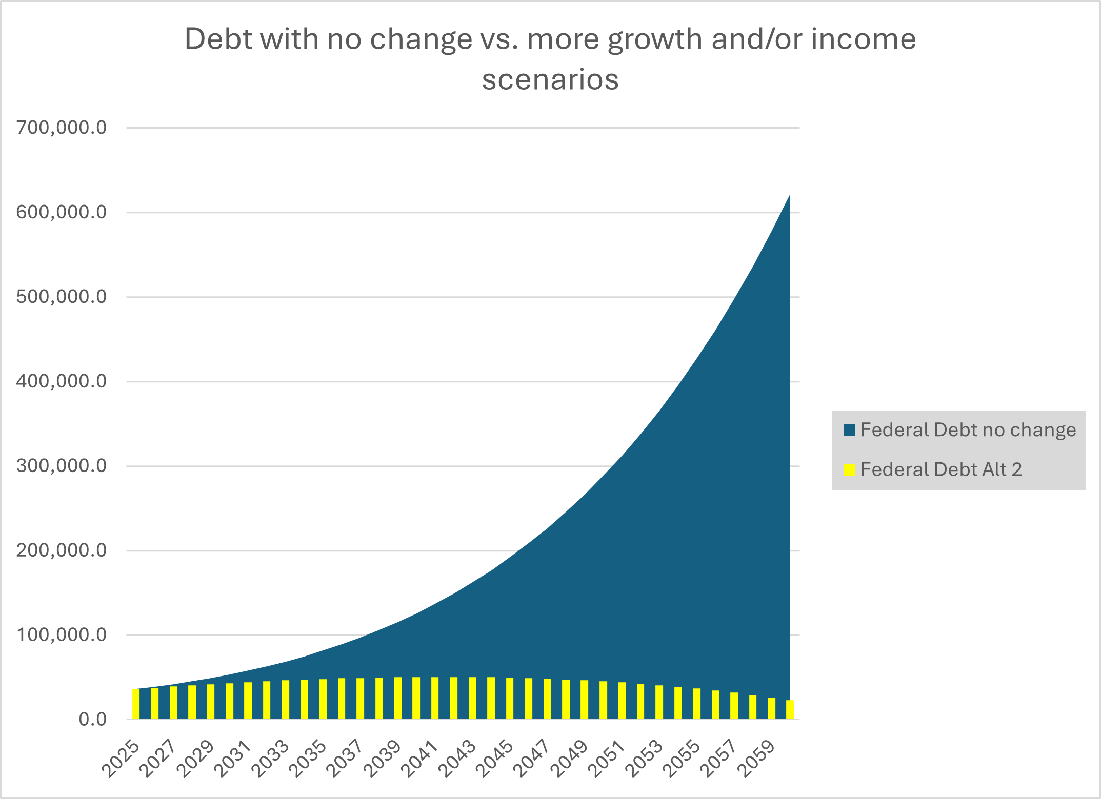
This chart illustrates that I don’t believe the status quo is an option. If the metrics don’t change, I don’t believe our country can exist with a debt burden of $600 trillion.
I believe change is necessary.
I don’t know what change would be the most appropriate. But I welcome attempts to do something different, no matter who would be in charge. These are unchartered waters for our nation and there will be bumps along the way.
I believe in our system. As reckless as I think politicians have been with money over much of my adult life, the reckoning of reality has come, we crossed $1 trillion of annual interest payments on federal debt. That is a tough one to ignore. And no matter what might be said in public, I have to think (hope) those in Washington are well aware of the data when behind closed doors. We have checks and balances in our system in government, judicial, and through the American people. And the intelligence of that system will be shown in full force throughout the coming years.
In the meantime, here is another helpful resource, Jamie Dimon’s annual letter to shareholders.
Here are some ideas of what you can do productively at a time like this.
I did not ever think we’d have a full market recovery from the decline in 2022 till mid 2025 or even into 2026 and have been communicating this since early 2023. While it would be nice to have seen an uninterrupted recovery, that’s never realistic. Keep focused on the future and hang in there a bit longer.
I view whether to be more defensive or opportunistic going into volatility based on what the state of the economy was prior to it. We had a strong economy going in, and therefore I believe we will find a way forward through this.
On that note, I believe this volatility is self-induced with the tariff strategy. If necessary, I believe we can also step back from the aggressive approach if it were to put our nation in a bad spot. Recessions decrease federal income and increase deficits. The government is working toward the opposite outcome. They want growth.
Pre-retirees, like always, can take advantage of volatility by buying heavily into depressed stock prices. Market downturns are one of the few sales that consumers run away from, but they are historically the best time to buy deals. Max out your Roth 401k if possible.
Retirees can monitor their “non-equity” funds available for safer withdrawals against their anticipated spending needs over the coming few years. For our clients where we have been discussing your distribution needs, we’ve been “building the burn” that is your safety net to continue riding through the market volatility.
Retirees and pre-retirees can also review whether Roth conversions are appropriate and could convert portfolios at depressed prices to eventually recover and resume new heights in a tax-free Roth account.
Look for opportunities. Change can be scarry. But what’s scarier is if we kept going down the same path. Look for possibilities within your company, your job, and your life to take advantage of a different direction. AI is here to stay and will be an immensely helpful tool. It will replace some of the jobs we have today. It will also open opportunities.
I firmly believe we need to produce more things in our country. We have more tools available to us than ever before. Let’s see what we can create. A common t-shirt in Detroit is “Detroit Hustles Harder.” Let’s hustle as a nation.
We are thinking of you and working for you. We are always here to talk and strategize.
James –
Data collected from FRED (St. Louis Federal Reserve), Treasury Direct, IRS, BEA.gov, and Car and Driver.
The material is for informational purposes only. It represents an assessment of the market environment at a specific point in time and is not intended to be a forecast of future events, or a guarantee of future results. It is not guaranteed by any entity for accuracy, does not purport to be complete and is not intended to be used as a primary basis for investment decisions. It should also not be construed as advice meeting the particular investment needs of any investor.
Securities offered through Kestra Investment Services, LLC (Kestra IS), member FINRA/SIPC. Investment advisory services offered through Kestra Advisory Services, LLC (Kestra AS), an affiliate of Kestra IS. JP Studinger Wealth Advisors, LLC is not affiliated with Kestra IS or Kestra AS https://www.kestrafinancial.com/disclosures